
Conversion rise from 2.1% to 2.8% //
33% increase on the flow carrying 40% of yearly revenue.
Context
[Company Background]
Creators of Kali Linux and the industry standard in offensive security training and certification, serving enterprise clients like Garmin, Amazon and Palo Alto Networks. Buy More is the flow that serves the B2C side, where individual learners buy courses, subscriptions and exam attempts directly to build their careers in cybersecurity.
[Team Involved & Timeframe]
Product Manager // Principal Product Designer // Senior Product Designer // Engineering Squad: 6 Back-End, 2 Front-End.
Q2 2026, followed by a 12 week incremental rollout.
[Key Stakeholders]
CEO // Head of Product // Head of Marketing.
[Role]
Principal Product Designer, leading the redesign of the flow behind 40% of OffSec’s revenue from discovery stage to release: framing the problem with product and data, shaping the strategy through co-design sessions with the PM, owning the IA and code prototyping, while directing the wider design work, and aligning the CEO, Head of Product and Head of Marketing behind a 12-week incremental rollout strategy.
Why the Change and Why Did it Matter?
[Business Problem]
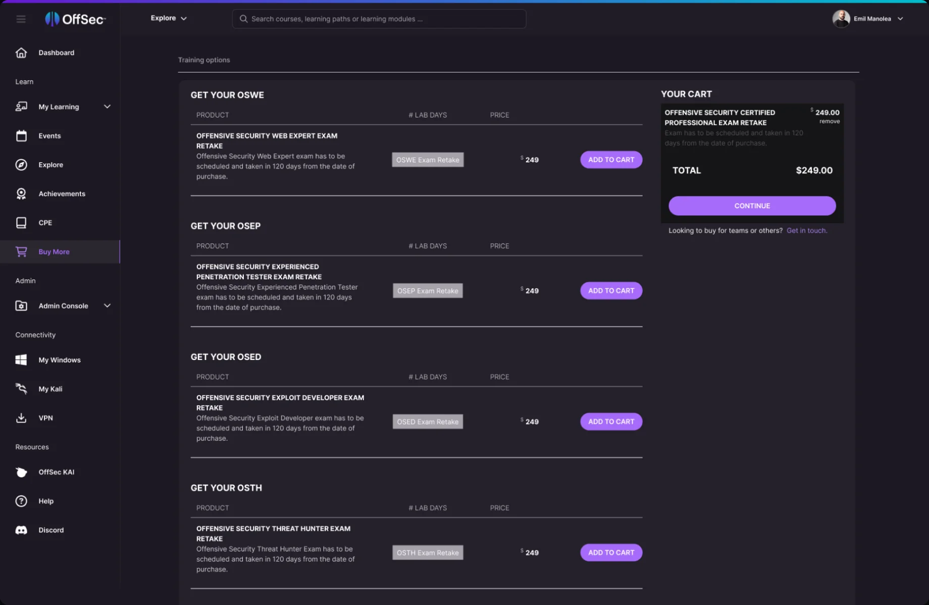
- Buy More brings in about 40% of revenue, so it’s the flow nobody wants to touch. But it had to change: no source files, and it had to move to the new platform design language.
[User Problems]
- Cognitive overload: everything on one page, no hierarchy.
- Inconsistent information: one column with four different meanings.
- Course start date picked outside the purchase, causing confusion.
[Trigger]
- The platform redesign meant Buy More had to move to the new look and feel.
Discovery & Key Findings
[How We Approached It]
- Ran a series of working sessions with the PM and the Senior Designer to map every problem in the flow.
- Partnered with the Head of Data to establish the baseline: 2.1% conversion on this flow.
- Partnered with Marketing to understand how customers buy.
- Reviewed feedback from our Discord community on the Buy More flow.
- Documented all findings in Confluence, linked to the Jira ticket, so design, product and engineering worked from the same source.
[Key Findings]
- 90%+ of customers buy a single, high-value product (around $1,700 to $2,700).
- Two different buyers: new customers choosing their first training, and existing customers.
- Existing customers often come for extensions, subscriptions and certificates.
- Feedback told us Buy More felt confusing and information was hard to find.
Solution
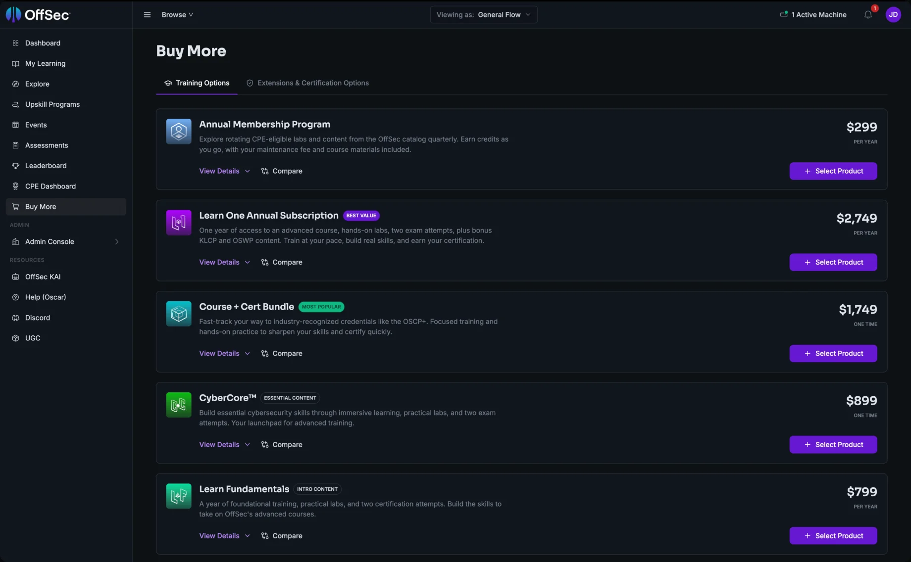
- New IA: content split into two tabs, Training Options and Extensions & Certification Options
- Cards instead of a table: each product is its own card, so details, price and actions sit together
- Pricing grouped in one place, with the billing period always under the price, replacing the confusing middle column
- Compare functionality added
- Labels added to guide the choice (Best Value, Most Popular, Essential Content, Intro Content)
- Product icons and short descriptions for every product
- One consistent CTA across all products
- Rebuilt on the new design system
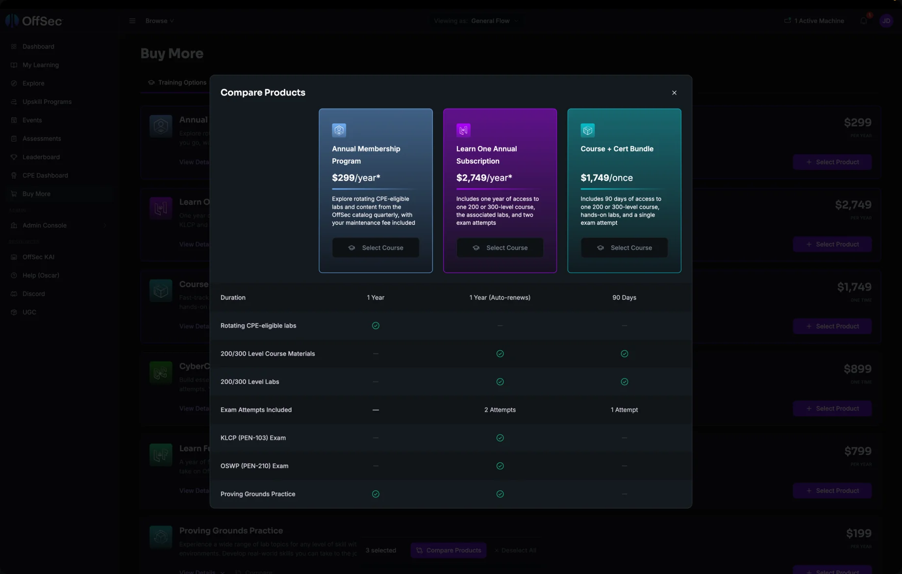
- Side by side columns make the differences between products easy to see, so buyers can choose without opening each one
- The feature table answers the questions people ask before a big purchase: how long, what level, how many exam attempts
- Included vs not included is clear at a glance, so the trade off between price and value is obvious
- Buyers can select straight from the comparison, so the decision leads directly to the purchase
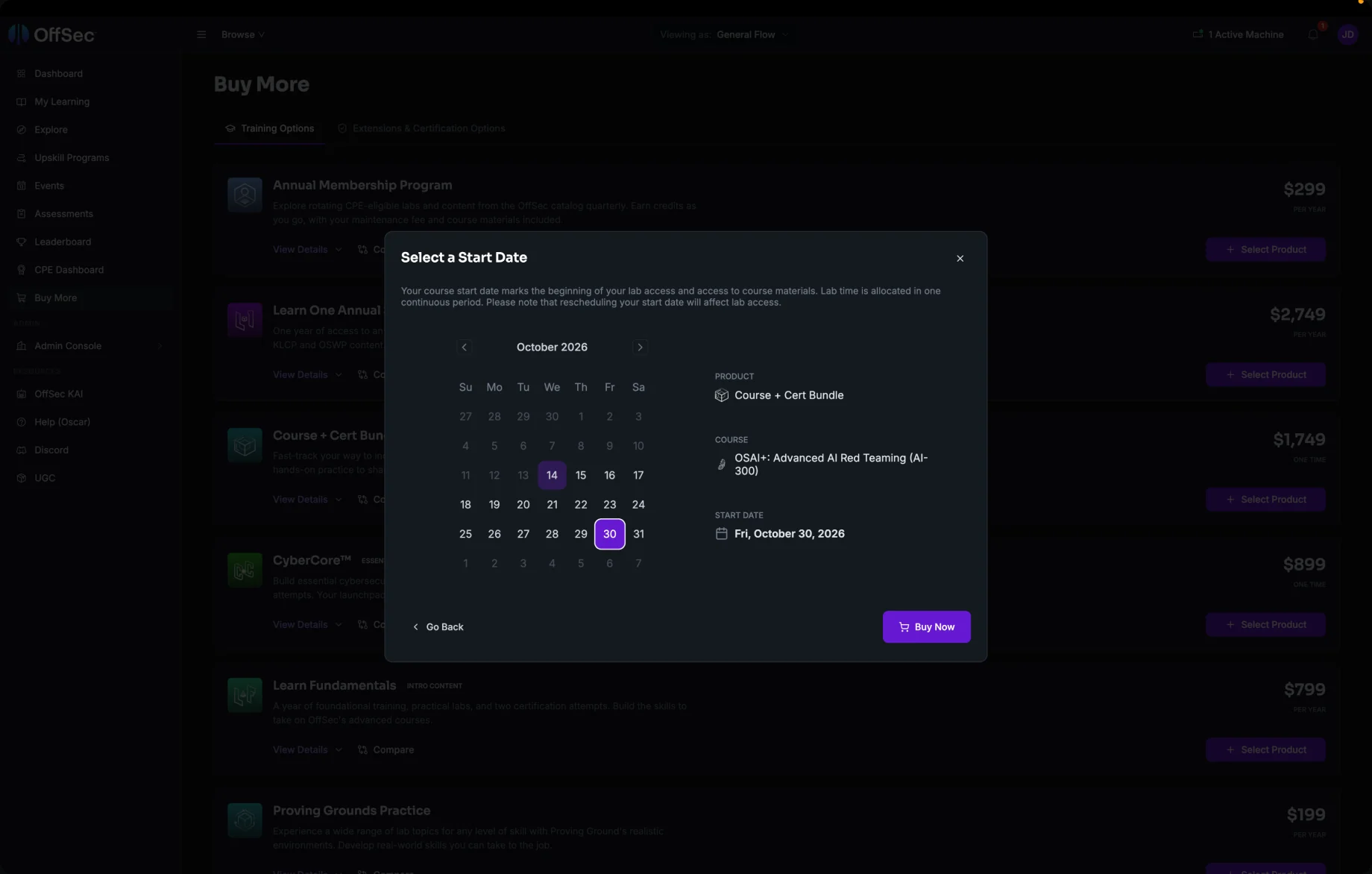
- No more confusion about when the course starts: it’s decided at the moment of buying
- Buyers plan their training around their own schedule before committing the money
- No surprises after paying: they know exactly what they bought and when their access begins
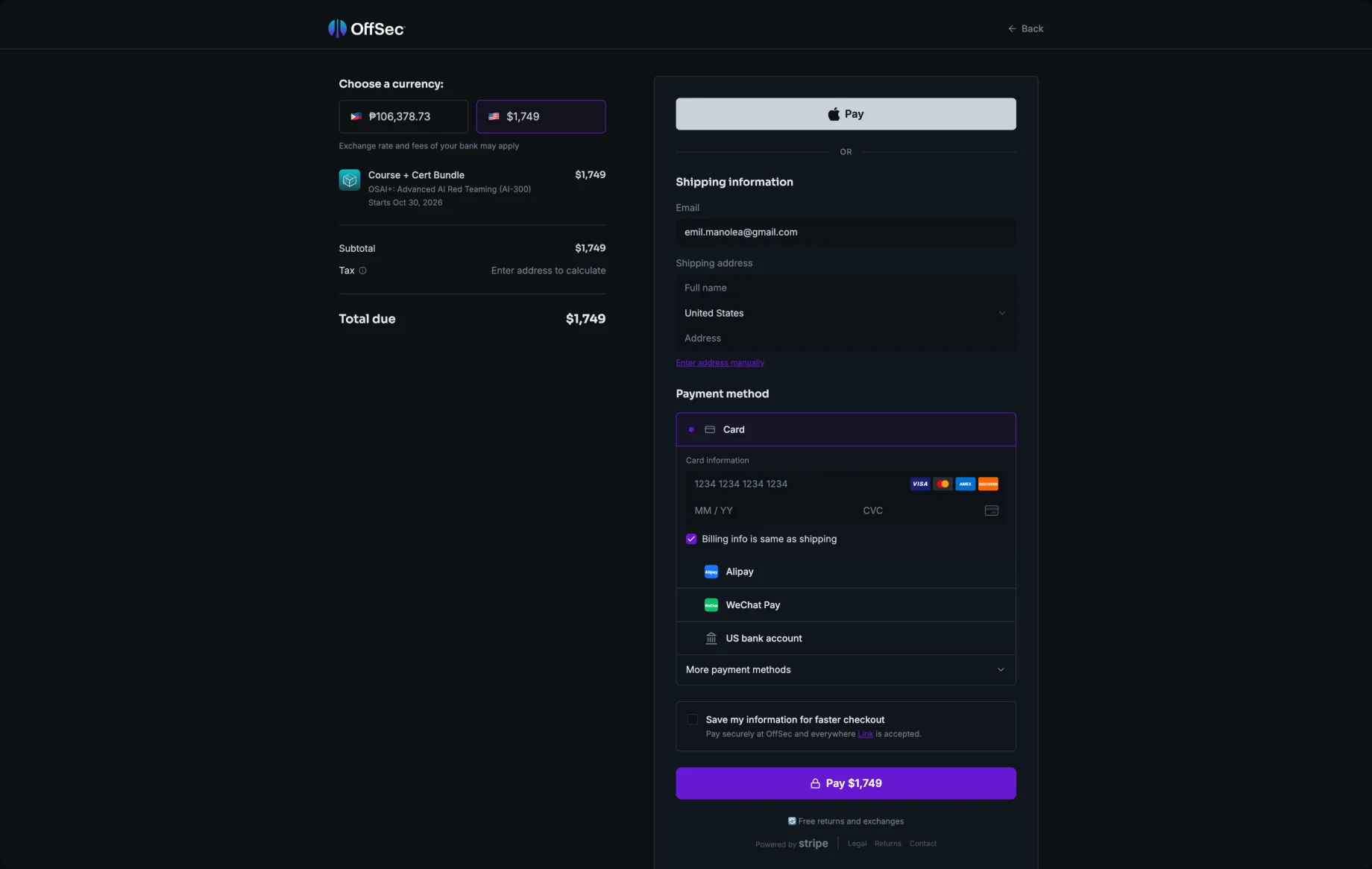
- Stripe integrated into OffSec’s new design system, giving buyers a familiar, trusted way to pay that still feels like part of OffSec
Tough Decisions and Trade Offs
[Removing the Shopping Cart]
Customers used to add products to a cart, then go to checkout. Since 90%+ buy a single product, we removed the cart and took them straight to checkout, making the flow much simpler.
[Two tabs instead of three]
The first version had three tabs, with subscriptions as their own. We merged subscriptions into Training Options to simplify how products are defined and reduce the number of choices buyers have to think about.
[Releasing in increments, against a faster launch]
The CEO wanted the new flow live by the end of Q2. With 40% of revenue at stake, the PM and I made the case for releasing it in increments over 12 weeks, so we could measure each step and catch any drop in conversion early. With the Head of Product’s support, the CEO agreed.
[Trade-offs we accepted]
- The full release came about three months later than planned.
- Measuring conversion after every release added work for the data team.
- Without a cart, the small share of customers buying several products had to check out more than once.
- During the 12 weeks, users saw a mix of old and new screens while the release rolled out.
Outcome
- Conversion rose from 2.1% to 2.8%, a 33% increase on the flow carrying 40% of revenue.
- No drop during the 12-week rollout: conversion held steady through each release, then grew gradually.
- Buy More now lives in the new design system, so future changes no longer mean rebuilding it from scratch.